Bring your ideas to life with our services! From building stunning websites to boosting your online presence through SEO and digital marketing, we've got you covered. Our creative team also specializes in graphic design, making your brand stand out. Explore our services, and let's make your vision a reality!
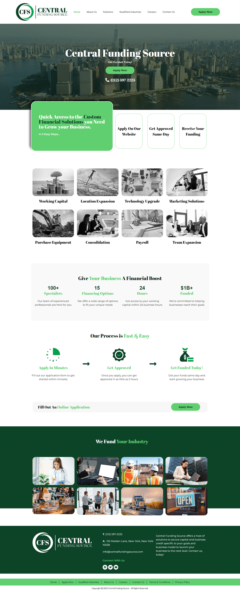
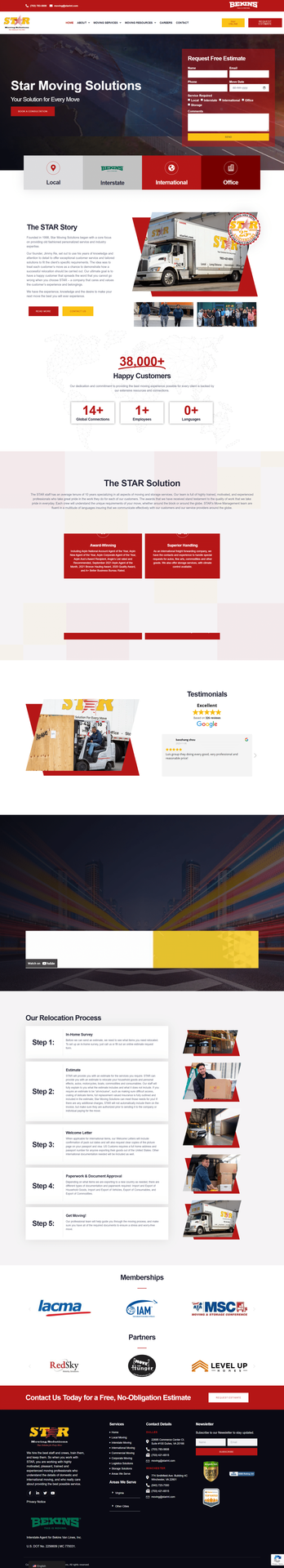
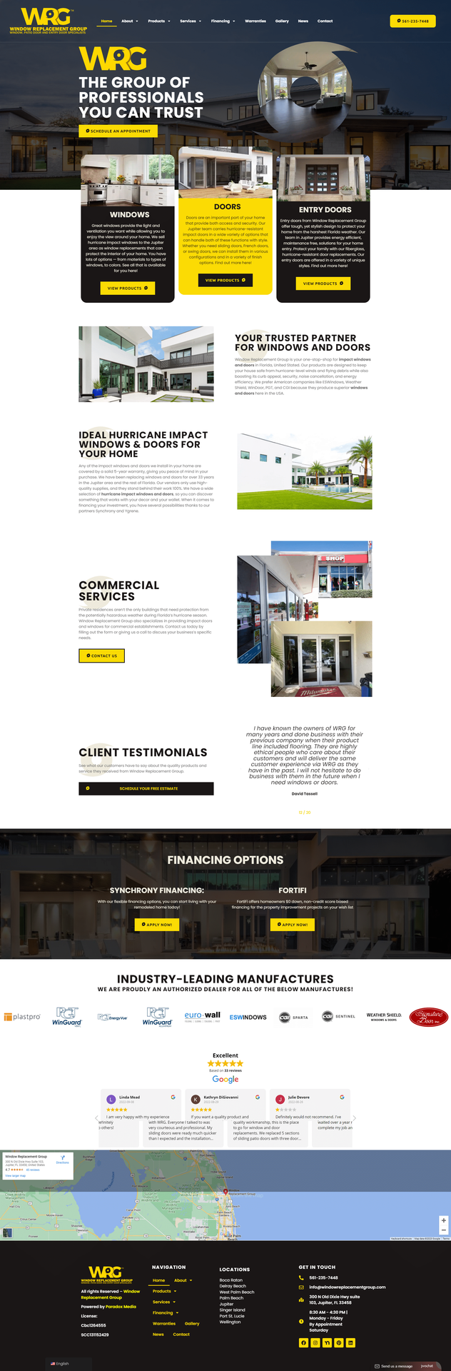
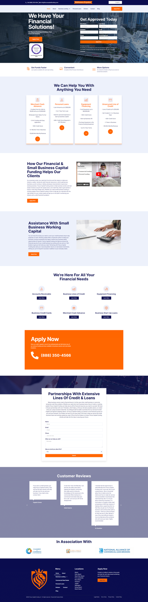
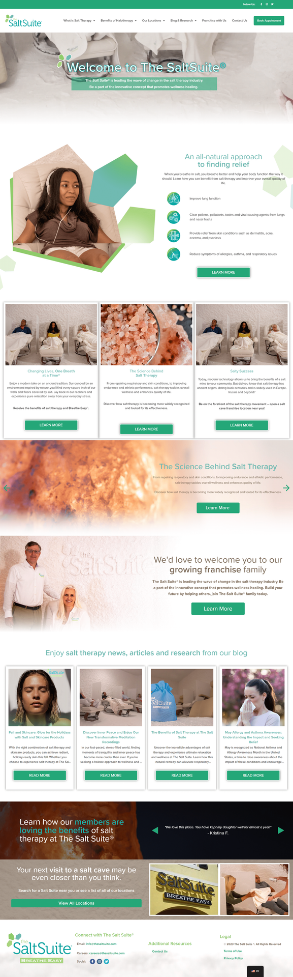
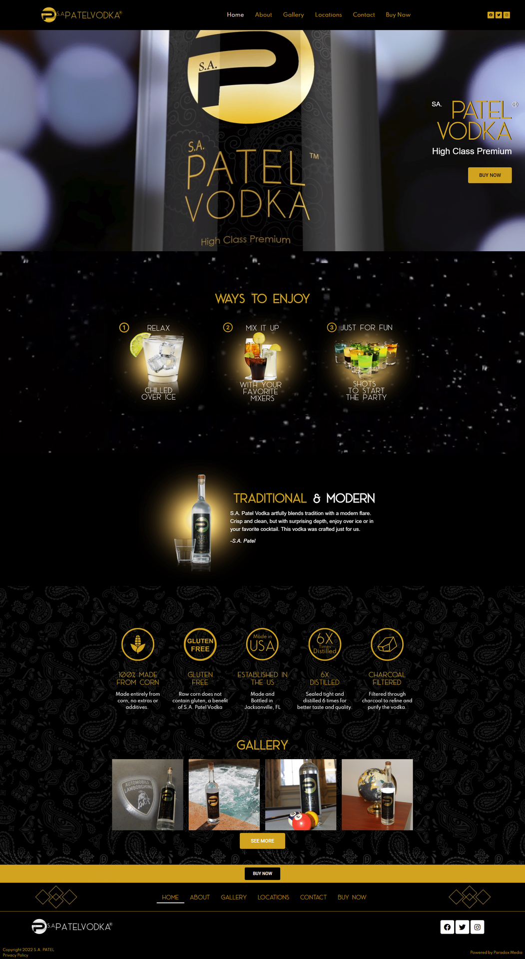
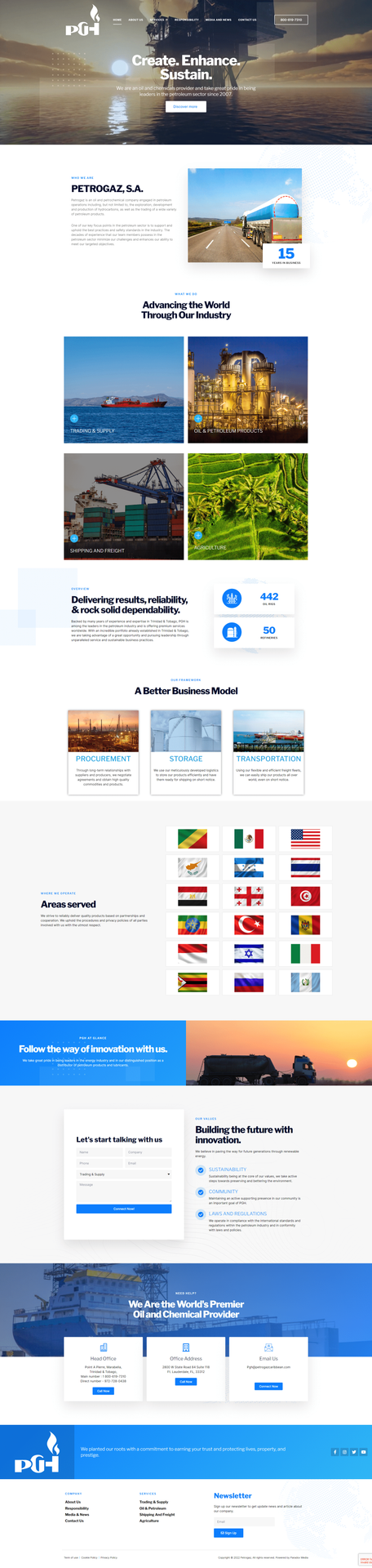
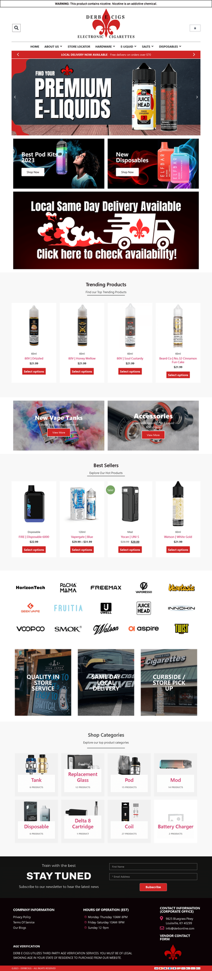
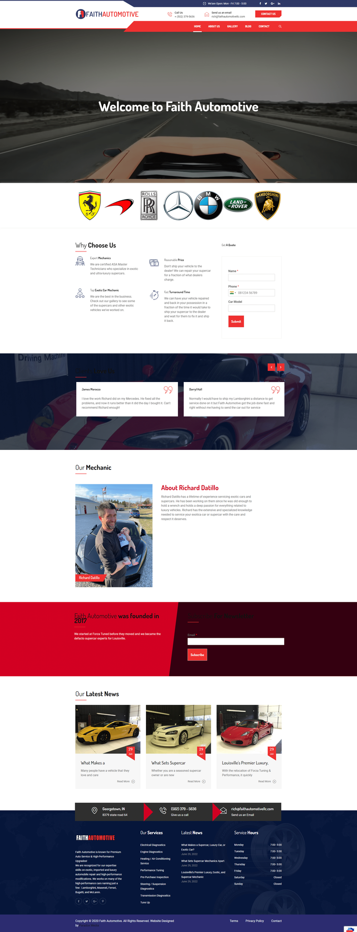
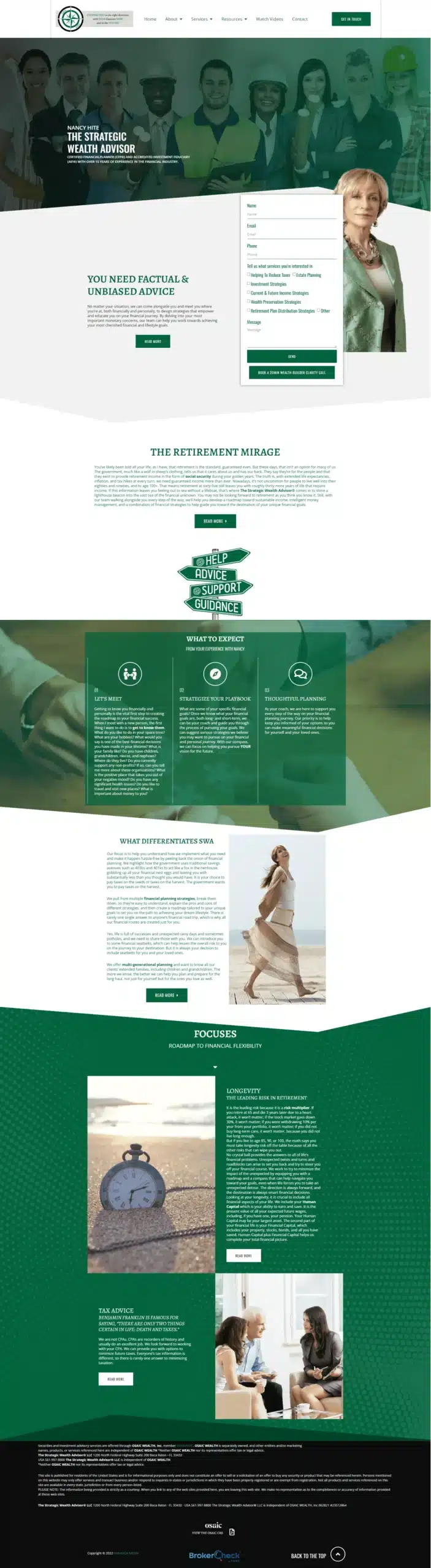
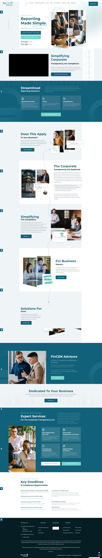
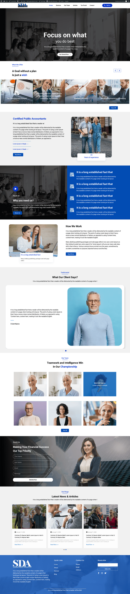
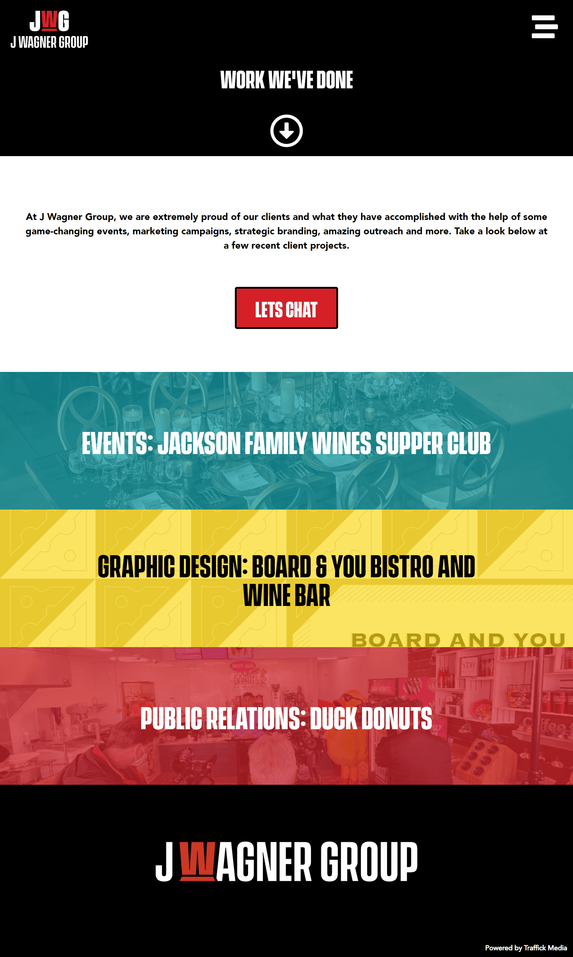
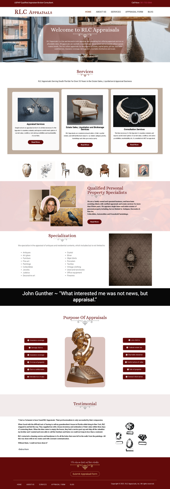
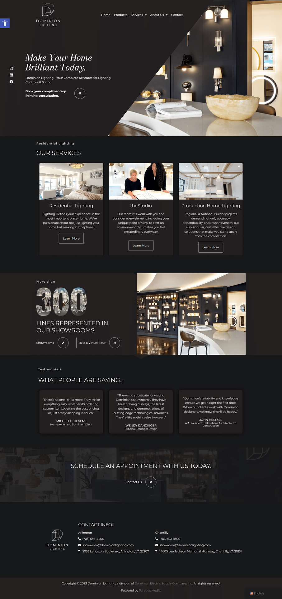
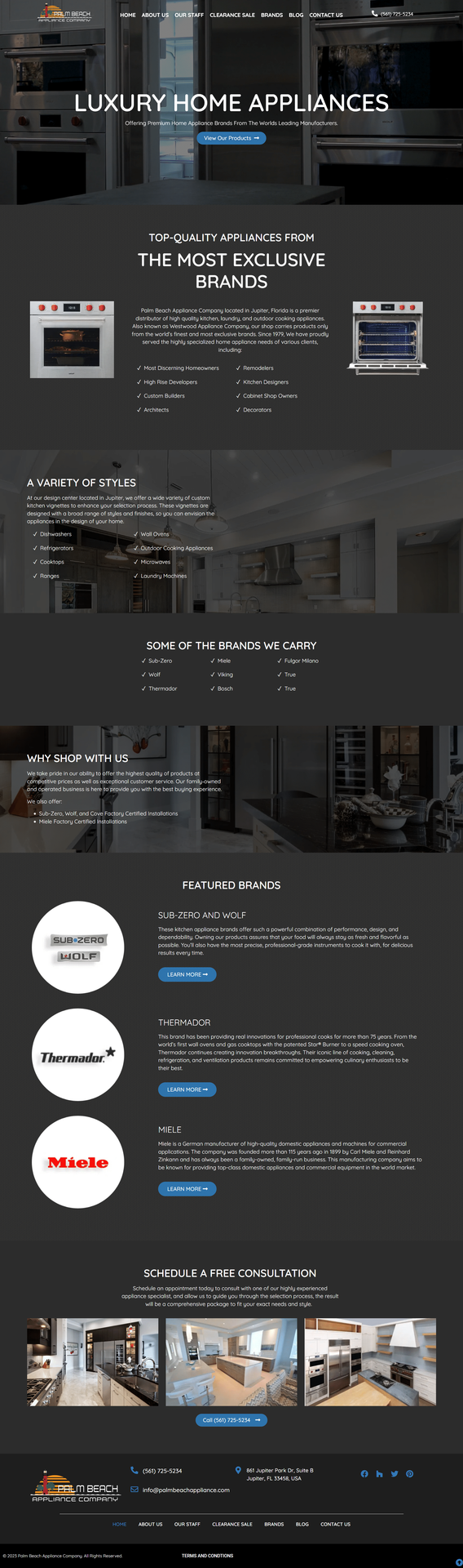
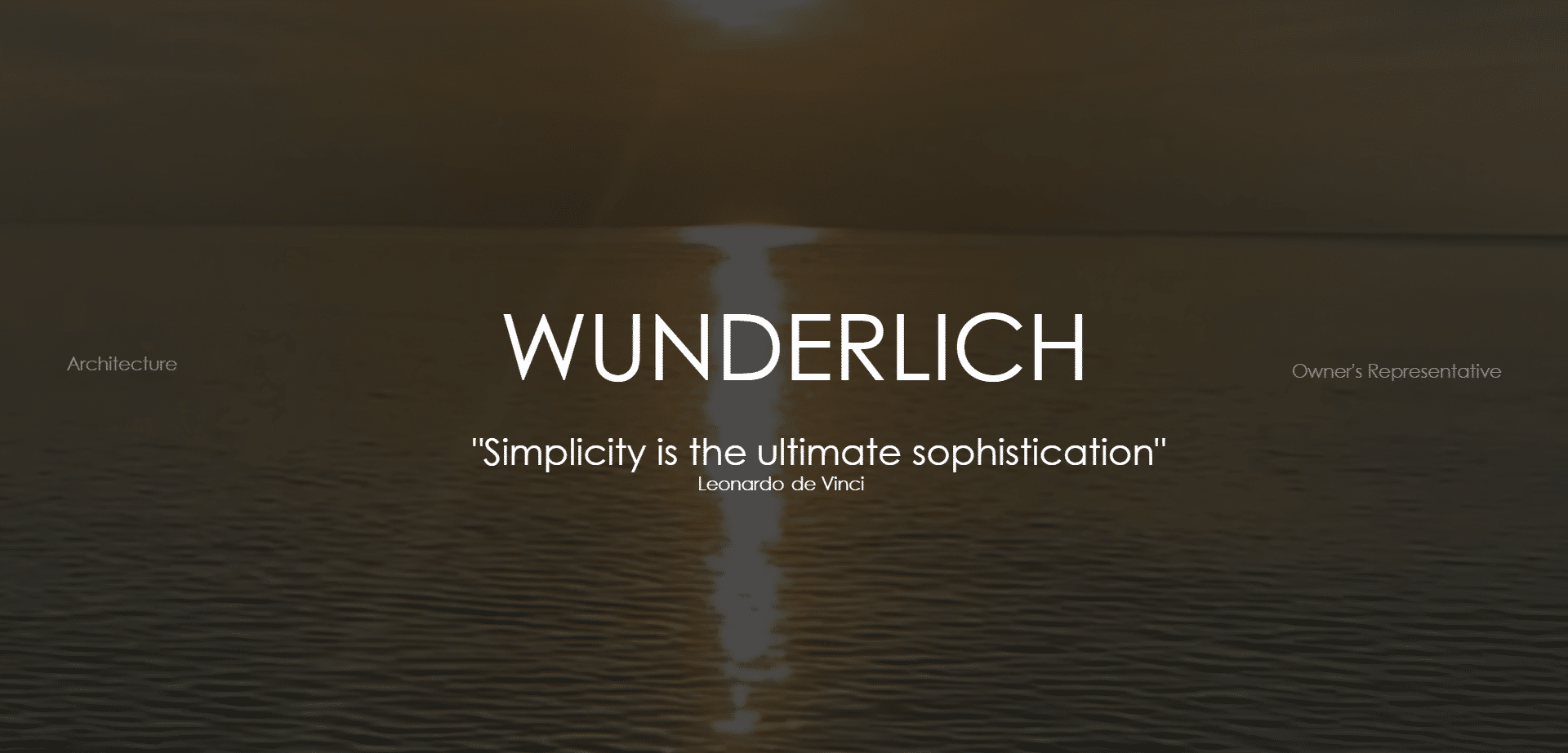
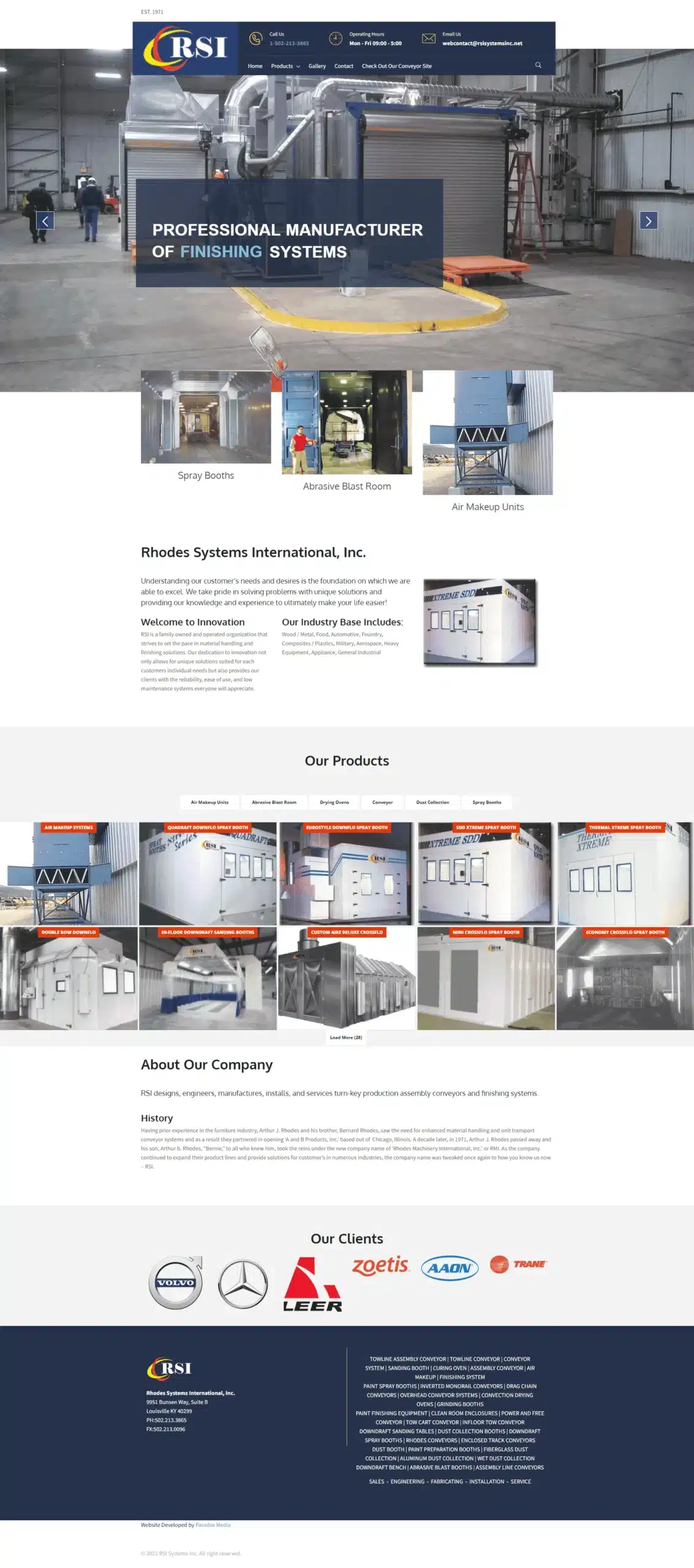
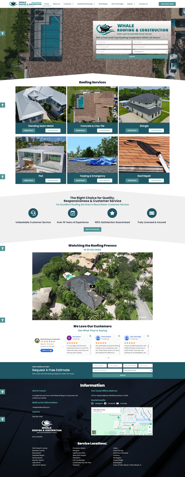
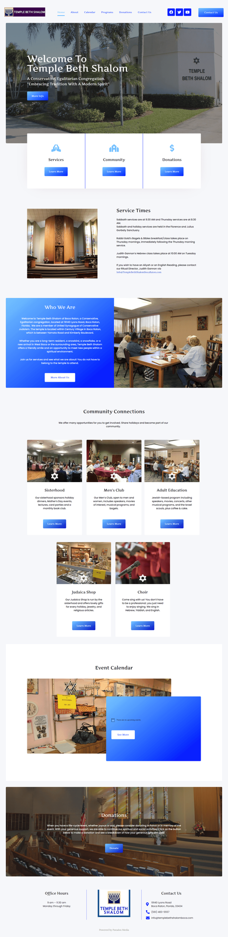
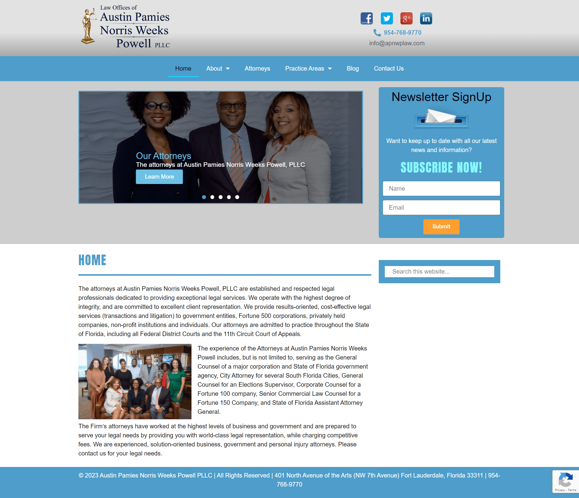
Where Creativity Meets Technology. Here, you’ll find a carefully curated collection of our most innovative and successful web development projects. Each project in our portfolio reflects our dedication to exceptional design, seamless functionality, and cutting-edge technology.